
Unleashing the Mind: Reflect
Exploring the Tools for Thought Universe

From Amplenote to Zettlr - a no-nonsense, in-depth analysis. This post is part of a series of articles digging deep into the current landscape of Tools for Thought.
In the last article of this series, we explored Heptabase. I explained why Heptabase is an excellent choice for people needing a PKM with a visual approach and excellent PDF annotations. This time, we explore Reflect, which combines a minimalistic yet powerful approach.

I heard about Reflect at the beginning of 2021 and joined their waitlist. I started using it during the summer of 2021.

Introduction
Reflect is an Electron-based knowledge management tool prioritizing security and performance with a less-is-more approach. Its beautiful, clean design supports light and dark modes.
It is available for Web, macOS, iOS, and iPadOS (Beta). Unfortunately there are no clients for Linux and Android yet.

Reflect offers a classical three-column layout. The left sidebar contains the search, links to the main areas (daily notes, all notes, tasks, and map), and your pinned favorites. The middle area is reserved for the content of your note, while the right sidebar contains a calendar (when a daily note is selected) and actions and links. There is no permanent open right sidebar where you can put additional notes (like we have seen in Amplenote and Heptabase before).
You can temporarily open another note in an overlay, but only with links within the current note or in the “related” or “similar” section on the right sidebar. I would love to see a more versatile approach here, allowing you to open any note in the sidebar from the command palette and add more than one. I often have meetings or work sessions that require information from more than one note, and Reflect feels limited here.

The mobile clients
Reflect’s mobile clients adapt their functionality to the screen size. The iOS version is the weakest one, offering only daily notes and all notes. You can’t get the task overview or map there.

The iPadOS version shows different views when in landscape or portrait mode. Portrait mode is almost functional, equivalent to the desktop version, with a left and a right sidebar but no overlay.

When rotating the iPad into portrait mode, you get a nice focused view of the note.

The Tasks overview (which I will explain later) is also supported:

Design
Reflect has a very polished, modern design. Its clean, excellent-readable font and few distractions make it easy to use. It doesn’t yet support different themes or UI customizations but has light and dark modes.


However, in dark mode, there seems to be a bug when selecting text (at least on macOS), which renders the selected text unreadable.

I’ve reported this bug and got a response from the CEO back in less than 4 hours:

The following day, I got feedback from a software engineer, confirming the bug (which is not Reflect’s responsibility), explaining it, and giving a workaround.

The workaround indeed solved the problem for me.
The PKM Process with Reflect
We will explore the PKM process in depth, from collecting information, organizing, and analyzing to reflecting, sharing, and updating.
Collecting
Reflect supports various ways to get information into the app:
Import from other apps
A block-based editor supporting linking as well as videos, images, and audio
Let OpenAI create content
Using the integrated calendar and daily notes
Using an external calendar and daily notes
Record audio notes and create transcripts
Highlights for web pages using the Chrome extension
Collect highlights and annotations from Kindle or Readwise
Using the share-extension on iOS
Import
Reflect supports import from Evernote, HTML, Logseq, Markdown, Mem, OPML (Workflowy), Roam Research, and their own JSON-based exports.
Block-based editor
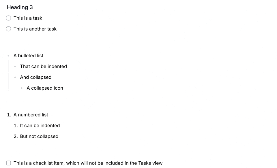
The editor supports all essential functions, headings, tasks and checklists, bulleted and numbered lists, quotes, and code snippets.

Some of you will miss the more advanced functions, such as tables, math formulas, and syntax highlighting for code.
Open-AI
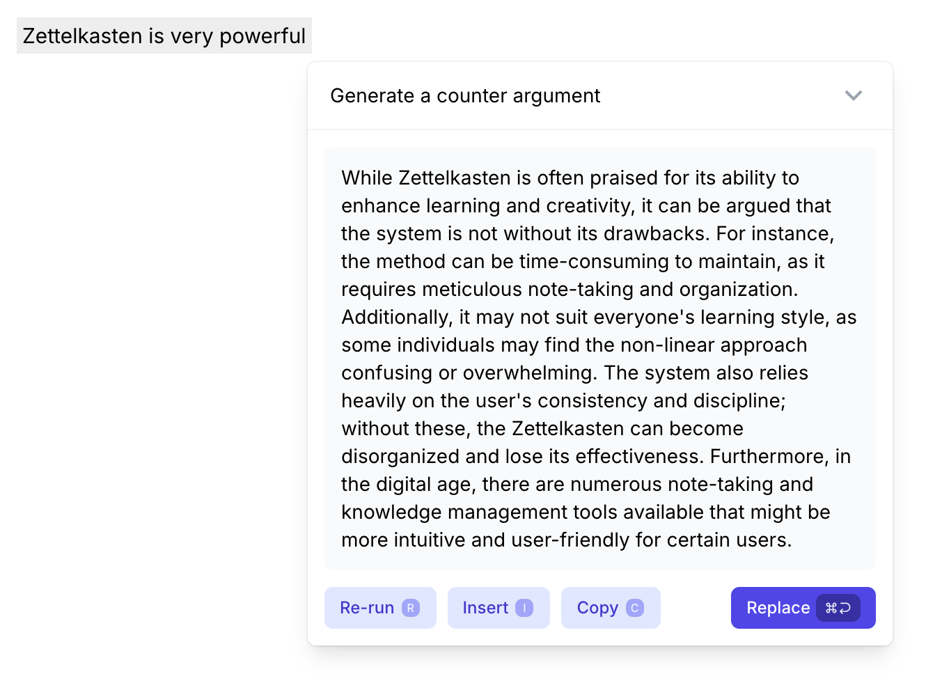
Reflect has one of the best AI integrations I’ve seen. It offers many valuable prompts and allows custom prompts.

Here, you can see Open AI generating a counterargument for a selected argument:
I also liked the “Decorate my writing with backlinks“ prompt, which puts essential terms into double square brackets.
Journal
You have an infinite daily notes page where you can scroll through your timeline. You can quickly mention these pages using NLP Dates (e.g., next Monday, last Friday, …). The calendar is in the right sidebar, where you can quickly jump to another date.

External calendars
Reflect also supports the integration of external calendars from Microsoft, Apple, and Google. Events will be shown in the right sidebar of your journal on the corresponding day. I like this clean and straightforward approach.
If you want, you can add your meetings to your daily notes page with a backlinked note.

Audio notes
You can add audio notes on your desktop or mobile app, which will be automatically transcribed and put under Audio memos. This is a great way to capture ideas while on the go quickly.

Highlights
Reflect offers an extension for Safari and Chrome that allows you to highlight web pages and transfer the content directly into your notes.

The Chrome plugin with the integrated highlighter works excellently but, unfortunately, does not allow highlighting images yet.

The plugin automatically creates a note in Reflect tagged with ‘#link’ containing the URL, a description, and the highlights you made.

This might be already enough for many users, but Reflect offers a Readwise integration for those needing more.
Readwise & Kindle
You can import all items from Readwise using the corresponding export function. Each import creates a new note tagged with #readwise and a type (article, book, tweet, …). The note will contain basic information like URL, author, and highlights.
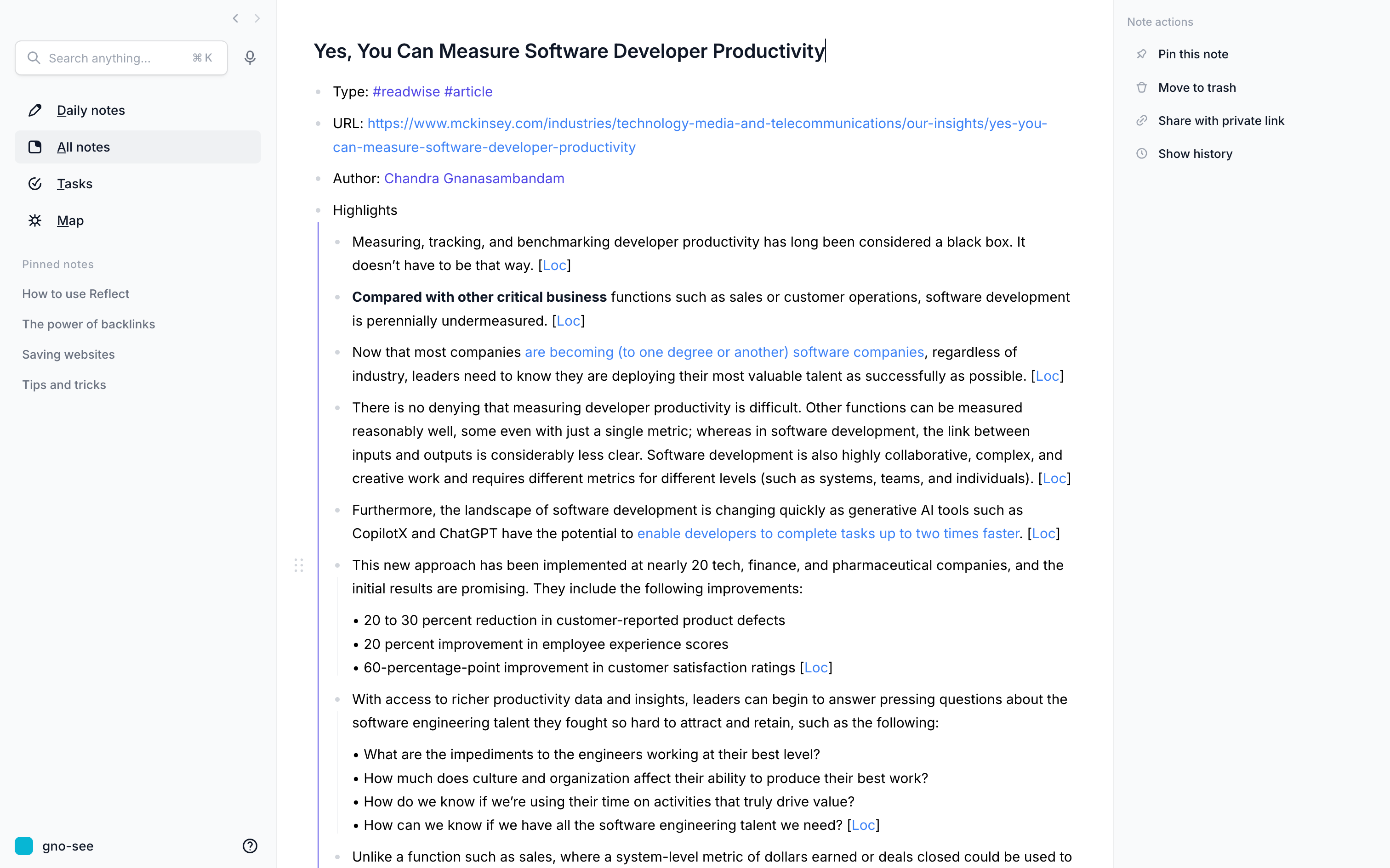
The note will be automatically linked from your daily notes page.

Organizing
Tags
Reflect uses tags mainly as a type indicator, offering ‘#books,’ '#person,’ and ‘#link’ as default. You can add as many custom tags as you want, but in the “All notes”-view, they are hidden behind the “Custom” button.
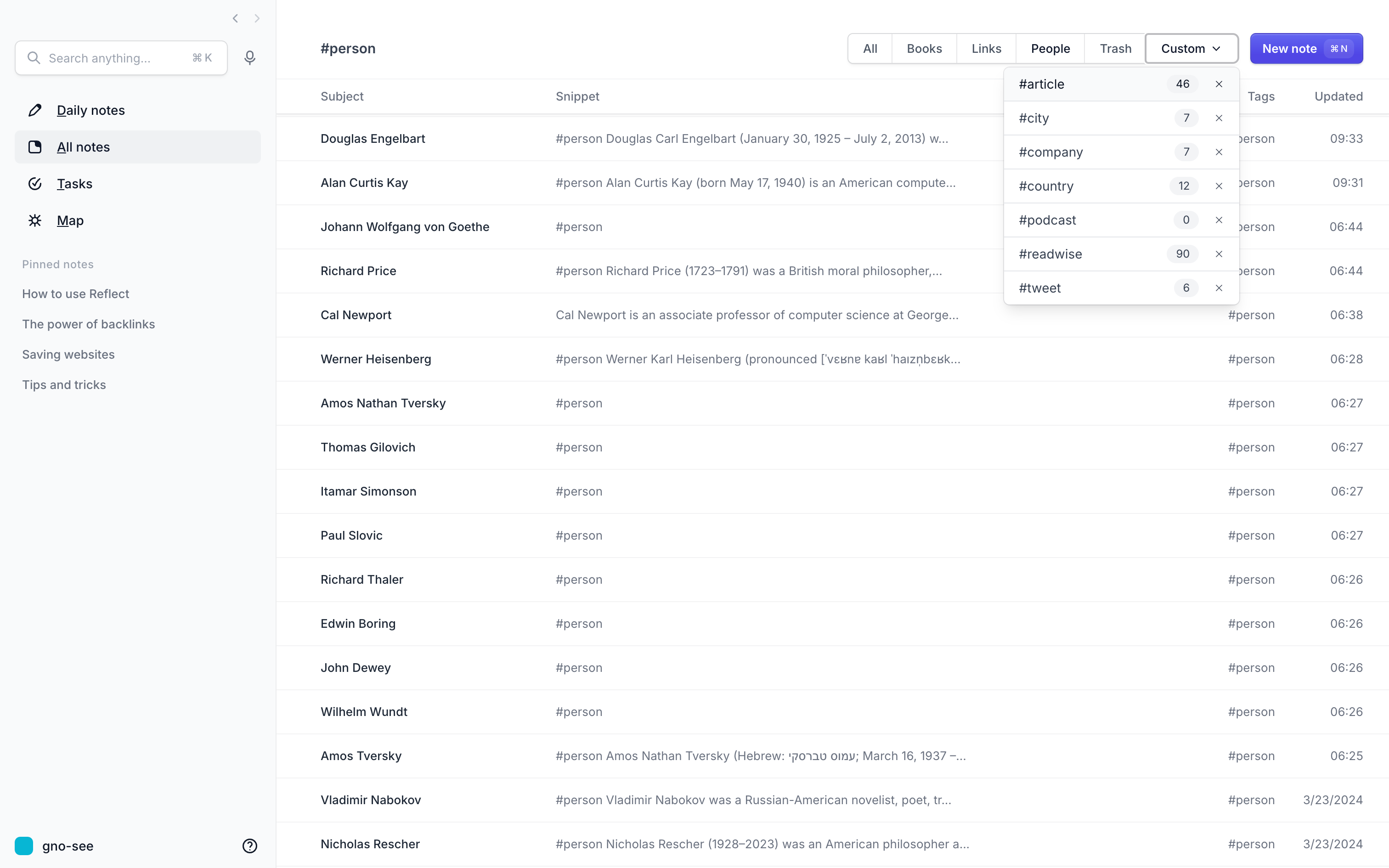
The “All notes” view is almost useless as soon as you have a few hundred items with a specific tag, so a quick search function or additional filters would be a welcome addition.
Collapsable lists
Headings are not collapsable, and Reflect doesn’t offer collapsable blocks. Lists are collapsable like in an outliner. You can also rearrange them with drag and drop.
Search
Reflect has one of the best search implementations available. It supports fuzzy search by default, which compensates for spelling errors or different grammatical forms.
Additionally, you can activate the semantic search, which searches for synonyms (e.g., searching for” fish” will find a note about sharks even if the word “fish” is not mentioned anywhere within the note). This does not work perfectly yet, but it is a welcomed addition with great potential for expansion.
You can also filter your notes based on creation date, modification date, and journals, having links to or from a specific note, being tagged with certain tags, being pinned or published.

I also love how Reflect presents the results, with its live update while you are typing and an extensive preview of the selected note.
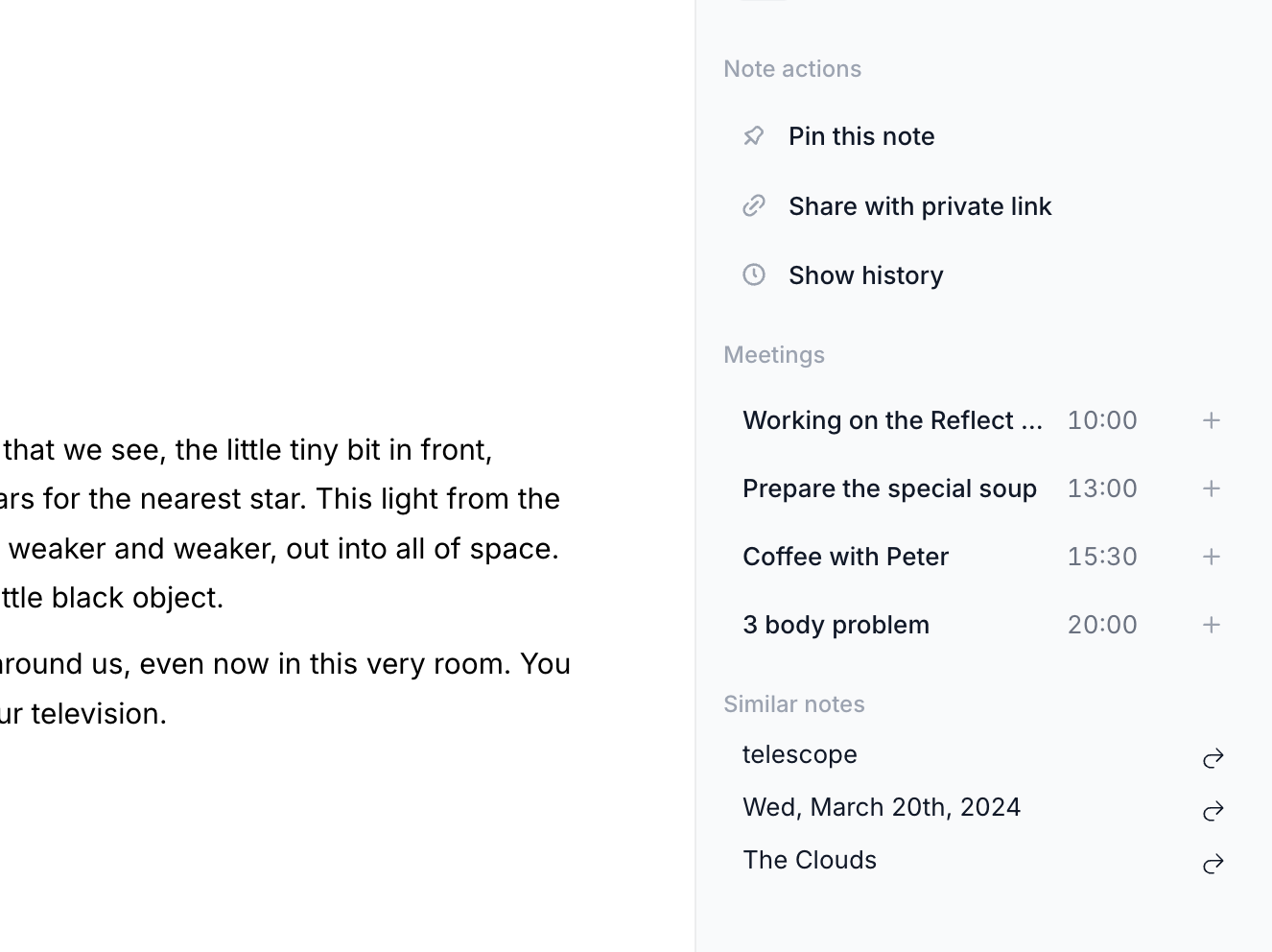
Similar notes
Reflect presents similar notes in the sidebar when you have a note open. I’m not sure what algorithm is used here, often it shows relevant notes, sometimes not.

Graph
Reflect has a beautiful graph that colors the nodes according to their type and scales them based on the number of connections.

The graph does not support searching or filtering for specific tags or nodes. Therefore, it is beautiful but primarily useless (not saying this is a bad thing). Reflect also doesn’t support local graphs which are based on the current note.
Backlinks
Reflect shows backlinks below the current note. I think there is a big chance for improvement here because the current implementation doesn’t work well as soon as you have a lot of incoming links.

You get a backlink for every block that contains a link to the current note. If the link is within a headline, you get the whole chapter below, which could be annoying. I also dislike that there is no grouping based on the source note. If a note has 20 links to the current one, you get 20 times the name of that page.

The same problem exists with suggested backlinks in the right sidebar. When having notes for standard terms, you get a very long list, which is almost impossible to handle.
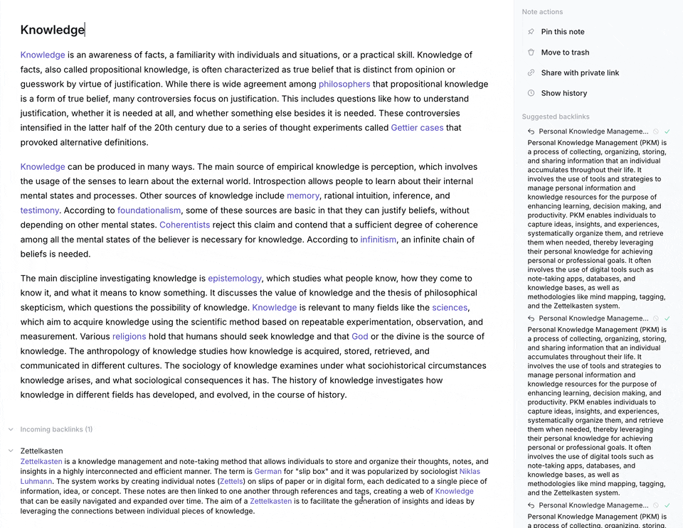
We need a multi-step process showing just the notes that contain a suggested backlink. After clicking on it, a dialog should open with a list of all locations and buttons to create the links.
Reflect
Chat
One of Reflect’s most powerful features is the ability to chat with your notes. After you set a focus in your search, you can ask questions, and Reflect will answer them, referencing your notes. OpenAI’s GPT4 powers this function; the subscription contains a 200,000-character contingent, but you can also use your own API key.
I’ll give two examples of this in the following two short videos.
Let’s start with questions about a project and the last meeting with its lead.
Let Reflect summarize my notes about Zettelkasten.
Please be aware that your content has to be submitted to OpenAI, which may raise privacy concerns.
Tasks
Reflect differentiates tasks from checklists, which is a smart move. While they look very similar (circle vs. square checkbox), they work differently.
When you add tasks to your notes, you can quickly find them in your Tasks Overview sorted by due date (which you set by adding a date to the same block). This is an exquisite way to control your ever-growing to-do lists. You can also search and filter your tasks, and the search results will show up instantly.

Another nice feature is adding new tasks from here (look at the small “+Add” in the screenshot). The new task will be added to the corresponding note.

Checklists aren’t included in these views and only exist in their current note. But often enough, this is more than sufficient.
Sharing
Publishing
You can quickly publish a note to the web using a private link. You can see an example here.
Exporting
The only way to export notes is to create an export of your whole graph. You can choose between JSON, Markdown, CSV, and HTML. The export does not contain attachments.

Share to Edit
Reflect does not support any multi-user editing.
Updating
Versioning
Reflect creates snapshots while you edit the notes. You can easily browse through old versions and restore them to a new note if you want.

Security
Infrastructure
Reflect is hosted on Google’s Firebase infrastructure. The company has not published any further information.
E2E-Encryption
All notes are encrypted on your client. Attachments and images are not encrypted. They also published the results of an independent security audit from 2021.
Ecosystem
Reflect’s ecosystem is small. There are no plugins or third-party themes. There are various ways to get information and support. They have a YouTube channel, a Discord channel, an Academy, a roadmap, and a public changelog.
Reflect also supports Zapier in integrating it with other apps.
Suggestions for the developers
Improve the backlinks section, make them collapsed by default order, group them by source, and add a filter function
Support Windows with a desktop app
Make the map (graph) useful with searching, filtering, and a local version that can be opened in the split view
Once local LLMs get more powerful, offer the option to use on instead of OpenAI
Add a more powerful right sidebar that can contain more than one note and can preview PDFs
Add the possibility to give internal links a different text (sometimes the in-built alias function can’t compensate for that)
Add the ability to highlight images with the web clipper
Improve the backlinks section, make them collapsed by default order, group them by source, and add a filter function
Enhance the “All notes” view, like filtering and searching, as well as sizing of the columns
Add an automatically generated TOC to the right sidebar based on the notes headings
Enhance the mobile apps with some gestures (like opening the search dialog when you swipe from top to bottom)
Add the ability to export single notes and support PDF export
Final verdict
I thought the Reflect review would be shorter, but I was increasingly convinced otherwise. I had a lot of fun working with it, and the less-is-more approach convinced me in many places. At first, I always thought, “I’m missin’,” but then I often concluded that less really can be more.
In addition, it has excellent performance, an outstanding search function, and an elegant, well-thought UI.
Mobile applications still need to catch up (especially iOS ones regarding tasks), and export options could be expanded.
I had a lot of fun with Reflect and can recommend trying it out yourself.
If you want to compare popular note-taking programs like Reflect on a detailed feature basis, I highly recommend NoteApps.info.